Reimagining the Subscription page of Zee5 premium
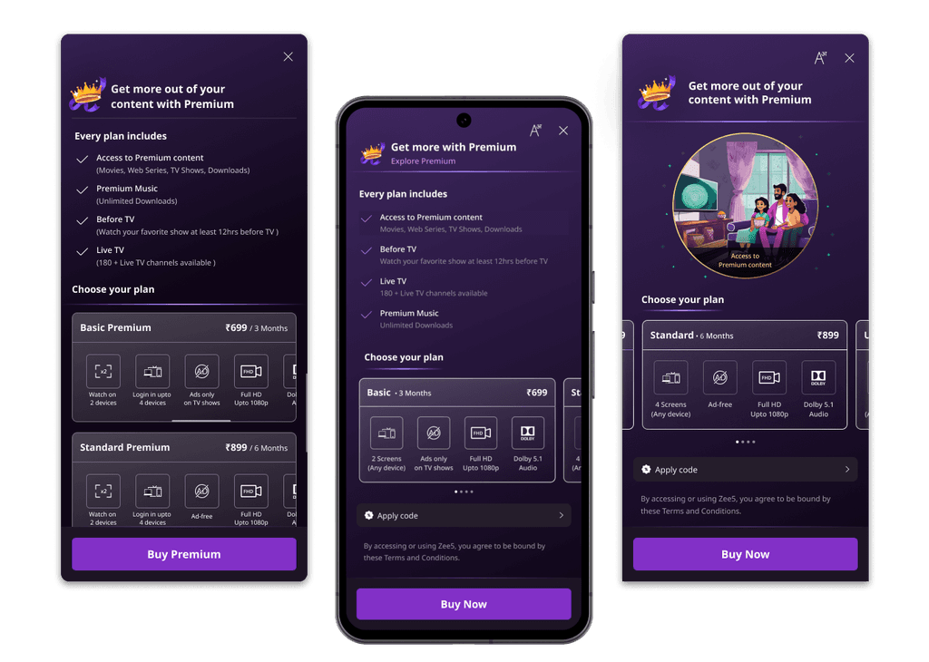
My Role
Research Synthesis, Desk Research, Stakeholder Analysis, Conceptual Design.
Team
4 Product managers, 2 UX Researchers, Design manager.
Duration
4 Weeks (Mar'24)
The Problem
The current subscription page has many content, navigation, and presentation issues. It's creating misconceptions and failing to provide adequate information for users to choose a suitable subscription plan, resulting in a low conversion rate.
The Solution
I have led and laid the foundation for the new subscription page. Explored various concepts and had multiple stakeholder reviews to solve the major issues. I devised different plan layouts, identified strengths and weaknesses, and chose the best direction for the design.
Background
Zee5 is a highest rated over-the-top streaming platform on Android Play Store and iOS App Store. There are multiple subscription plans for users to access premium content and other benefits. It currently has 10 million+ subscribed users in India and 5 million+ subscribed users globally.
This subscription page is a dedicated page in the application across all the devices to purchase or upgrade their premium subscription.
The Problem
The existing design of Zee5's subscription page has become increasingly difficult for users to navigate, leading to poor usability and an unintuitive user interface. Frequent changes to the plans and their benefits, driven by Zee5’s evolving business goals, exacerbate the problem. This rapid pace of customization is challenging for the team to manage within the current design framework.
A peak into Key Metrics

Source: Mixpanel
< 1 %
Conversion rate in Android and Progressive Web App
45.6 %
Complaints raised are related to Subscriptions
126 Sec.
Is the average time user spent to initiate the call to purchase.
Deep dive into problem space
In collaboration with user researchers and product managers
UX Audit
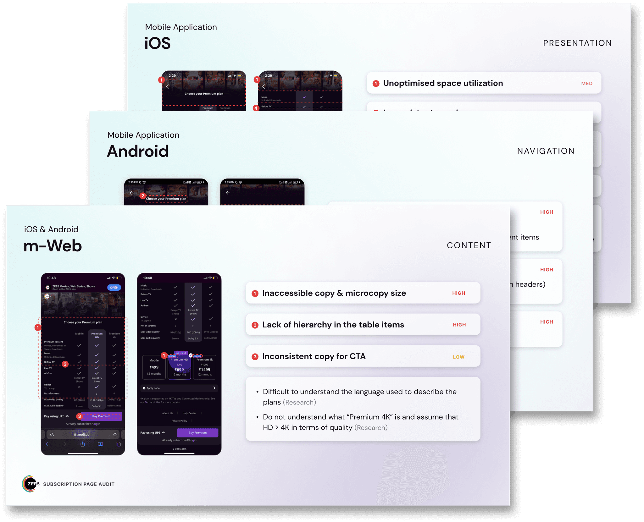
We conducted an audit of the current subscription purchase flow to assess the need to revamp the subscription page. We identified usability issues across different platforms (Android, PWA, iOS, CTV) and rated them based on Navigation, Presentation, Content, and Interaction heuristics. This assessment served as a foundation for our enhancements to the page.
User Testing - 5 Secs Test
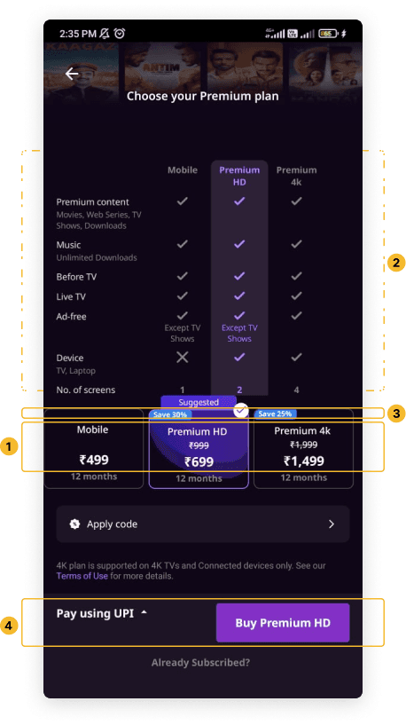
Participants are shown the page for 5 seconds and asked to recall the visuals to understand visual design and content hierarchy.
Plan Price & Names
Features (Scanned in order of user consumption need)
Offers on plans
Payment option
App Store review analysis
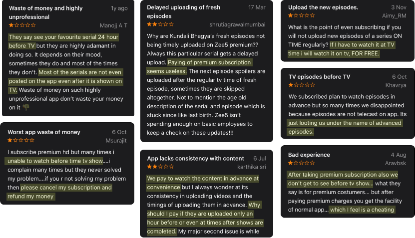
One benefit for Premium users is the ability to watch TV show episodes before they are air on television. This benefit is named "Before TV."
There are two problems associated with it:
Users couldn't understand the term "Before TV" because there is no help text to explain the benefit.
Many users find it misleading that they are unable to watch episodes before they air on TV as claimed.
Key Problems
Identified from all the above research methods
1
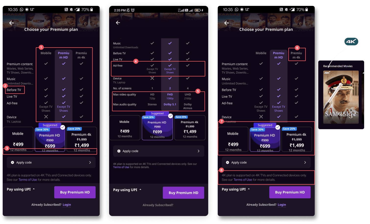
Many users were unable to compare premium plans as there was no indication that the benefits table was scrollable. Common benefits in all plans are on top of the table, eating first-fold real estate, and major plan differentiators are not visible.
3
Most users assumed that plans are rated per month at first glance. A few SVOD users also recalled taking monthly subscriptions to ZEE5.
5
Video and Audio Quality - A lot of users who don't understand terms like FHD, UHD, Dolby, and Stereo are often left out with no option to know more info about them.
7
The tabular structure of the plans is not dynamic enough to accommodate more than 3 plans. (It had usability issues in the past)
2
Before TV - Users who didn’t watch TV shows couldn’t understand what “Before TV” meant.
4
Ad-free - Creating confusion because of the additional text added because of the HVOD introduction (Premium with Ads).
6
The 4k plan was misinterpreted as it only works in 4k Devices, and 4k content is only accessible with the 4k plan. Because of that, we are missing a chance to sell other value-creating benefits, such as the number of devices and ad-free streaming with a 4k plan.
8
Users who were trying to explore what all content they will get in premium or were looking for specific needs like music (of self and family members) while comparing plans didn’t find a way of doing it or had to go back and search on home page.
Persuading Stakeholders
The most challenging task
Since it's one of the most important pages of Zee5, we need to convince many stakeholders from different teams to get the go-ahead. A consolidated presentation was given to the business team, product team to address all the key problems identified and advocate strongly for a redesign.
And they said YES!!!
And they said YES!!!

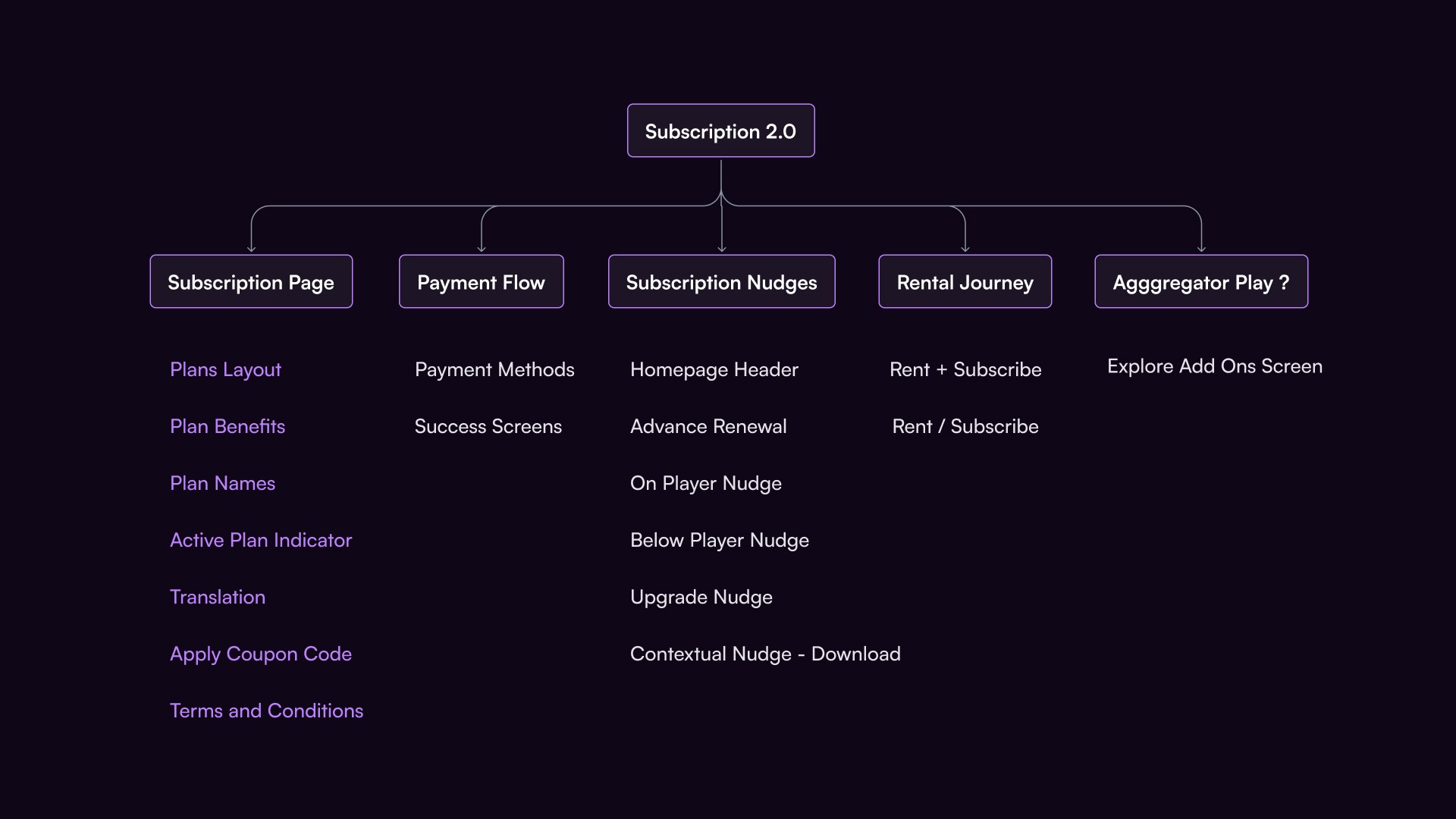
Setting up scope
Identifying and deciding the product areas to start with
Business Goals and Objectives
are defined along the process and not in the beginning
Future Proof Design: Dynamic enough for additional plans and seamless customization.
Ex: TV Shows & Mobile Only Plans
Reduce purchase journey duration: Help users quickly make decisions without information overload to avoid drop-offs.
Simpler terminology: an easy-to-understand way of explaining benefits and duration.
Increase conversion rate: More subscribers, More revenue.
Apply coupon: Keep it within the subscription page.
Design Objective
Explore numerous concepts, compare pros and cons, and select the best design for adaptable changes in the future and easy decision-making for the user. Prioritize solving for Android initially and then expand to other platforms.
Concept Design
Finding out the layout that works for us
I have gone through 100s subscription pages to find the best suitable layout for our use case scenario with the help of www.paywallscreens.com. I found these 4 major layouts and customized them according to our need to come up with concepts.

Early Concepts
After making a couple of wireframes with some out-of-the-box ideas and evaluating their feasibility, I have developed three viable concept ideas to address significant problems.
1
Helping users clearly learn about all premium benefits in an easy-to-understand manner
Text heavy screen - It might cause cognitive overload, poor readability and Slower comprehension
2
Easy to compare two next to next plans helps in better decision making
Users might be unfamiliar with with half vertical scroll and scroll within the card
3
Benefits icons for better Visual communication, Universal understanding and Space Efficiency.
Users can see all common benefits and plan specific benefits in single glance. Additionally users are familier with horizontal swipe
Future proof design for multiple plans
Common benefits section on the top
Clear plan names and benefits
Language translation is missing
Content information is required
FAQ Section is missing
Apply coupon code is missing
Concept iteration
After collecting feedback from all the stakeholders in multiple meetings, I made these exploratory concept designs of the subscription page with all the required features.
Simplified Plans
Plan cards with only 4 key benefits and emphasis on Name, Duration, and Price.
The number of screens and compatible devices are merged into one benefit for space optimization.
Video and audio quality terms have not been changed, assuming most users will get used to those terms.
Explore Premium
Explore premium bottom sheet for users to know more about all the different kinds of premium content they'll get along with the subscription. i.e., Movies, TV shows, Music, Live TV, etc.
It was designed to keep the users on the subscription page without going back to the home page to explore content.
Apply code
Earlier, we thought to keep applying the code on the payment page, but we had let the users know that they could apply the code and see the altered price.
Proactive Prompt
When users spend more time than the average plan selection time, we'll give a prompt to help users choose a plan based on their needs.
Key Decisions
Slashed prices can sometimes be perceived as a deceptive tactic. If users feel the original price was inflated just to make the discount appear more significant, it can erode trust in the brand.
The common benefits section is introduced at the top by separating them from the table of all plan benefits to make the comparison easy.
Tried to solve problems related to Before TV, Video and Audio quality, Ad-free, and 4K Term and Plan duration.
Way forward
There are countless gaps in the concepts I have created. However, these ideas helped the team envision and prioritize the requirements of the product and business teams.
In the future, we'd like to consider using a vertical scroll layout since 80% of our app interactions involve vertical scrolling in other sections. This may lead us to conduct A/B testing to compare the current layout with the proposed vertical scroll layout.
I was highly appreciated by the team for these innovative solutions and for giving the next designer a strong foundation to work upon. Unfortunately, I had to let go of this project mid-way as I'm no longer part of the organization.
Reimagining the Subscription page of Zee5 premium

My Role
Research Synthesis, Desk Research, Stakeholder Analysis, Conceptual Design.
Team
4 Product managers, 2 UX Researchers, Design manager.
Duration
4 Weeks (Mar'24)
The Problem
The current subscription page has many content, navigation, and presentation issues. It's creating misconceptions and failing to provide adequate information for users to choose a suitable subscription plan, resulting in a low conversion rate.
The Solution
I have led and laid the foundation for the new subscription page. Explored various concepts and had multiple stakeholder reviews to solve the major issues. I devised different plan layouts, identified strengths and weaknesses, and chose the best direction for the design.
Background
Zee5 is a highest rated over-the-top streaming platform on Android Play Store and iOS App Store. There are multiple subscription plans for users to access premium content and other benefits. It currently has 10 million+ subscribed users in India and 5 million+ subscribed users globally.
This subscription page is a dedicated page in the application across all the devices to purchase or upgrade their premium subscription.
The Problem
The existing design of Zee5's subscription page has become increasingly difficult for users to navigate, leading to poor usability and an unintuitive user interface. Frequent changes to the plans and their benefits, driven by Zee5’s evolving business goals, exacerbate the problem. This rapid pace of customization is challenging for the team to manage within the current design framework.
A peak into Key Metrics

Source: Mixpanel
< 1 %
Conversion rate in Android and Progressive Web App
45.6 %
Complaints raised are related to Subscriptions
126 Sec.
Is the average time user spent to initiate the call to purchase.
Deep dive into problem space
In collaboration with user researchers and product managers
UX Audit
We conducted an audit of the current subscription purchase flow to assess the need to revamp the subscription page. We identified usability issues across different platforms (Android, PWA, iOS, CTV) and rated them based on Navigation, Presentation, Content, and Interaction heuristics. This assessment served as a foundation for our enhancements to the page.

User Testing - 5 Secs Test
Participants are shown the page for 5 seconds and asked to recall the visuals to understand visual design and content hierarchy.
Plan Price & Names
Features (Scanned in order of user consumption need)
Offers on plans
Payment option

App Store review analysis
One benefit for Premium users is the ability to watch TV show episodes before they are air on television. This benefit is named "Before TV."
There are two problems associated with it:
Users couldn't understand the term "Before TV" because there is no help text to explain the benefit.
Many users find it misleading that they are unable to watch episodes before they air on TV as claimed.

Key Problems
Identified from all the above research methods

1
Many users were unable to compare premium plans as there was no indication that the benefits table was scrollable. Common benefits in all plans are on top of the table, eating first-fold real estate, and major plan differentiators are not visible.
3
Most users assumed that plans are rated per month at first glance. A few SVOD users also recalled taking monthly subscriptions to ZEE5.
5
Video and Audio Quality - A lot of users who don't understand terms like FHD, UHD, Dolby, and Stereo are often left out with no option to know more info about them.
7
The tabular structure of the plans is not dynamic enough to accommodate more than 3 plans. (It had usability issues in the past)
2
Before TV - Users who didn’t watch TV shows couldn’t understand what “Before TV” meant.
4
Ad-free - Creating confusion because of the additional text added because of the HVOD introduction (Premium with Ads).
6
The 4k plan was misinterpreted as it only works in 4k Devices, and 4k content is only accessible with the 4k plan. Because of that, we are missing a chance to sell other value-creating benefits, such as the number of devices and ad-free streaming with a 4k plan.
8
Users who were trying to explore what all content they will get in premium or were looking for specific needs like music (of self and family members) while comparing plans didn’t find a way of doing it or had to go back and search on home page.
Persuading Stakeholders
The most challenging task
Since it's one of the most important pages of Zee5, we need to convince many stakeholders from different teams to get the go-ahead. A consolidated presentation was given to the business team, product team to address all the key problems identified and advocate strongly for a redesign.
And they said YES!!!
And they said YES!!!

Setting up scope
Identifying and deciding the product areas to start with

Business Goals and Objectives
are defined along the process and not in the beginning
Future Proof Design: Dynamic enough for additional plans and seamless customization.
Ex: TV Shows & Mobile Only Plans
Reduce purchase journey duration: Help users quickly make decisions without information overload to avoid drop-offs.
Simpler terminology: an easy-to-understand way of explaining benefits and duration.
Increase conversion rate: More subscribers, More revenue.
Apply coupon: Keep it within the subscription page.
Design Objective
Explore numerous concepts, compare pros and cons, and select the best design for adaptable changes in the future and easy decision-making for the user. Prioritize solving for Android initially and then expand to other platforms.
Concept Design
Finding out the layout that works for us
I have gone through 100s subscription pages to find the best suitable layout for our use case scenario with the help of www.paywallscreens.com. I found these 4 major layouts and customized them according to our need to come up with concepts.

Early Concepts
After making a couple of wireframes with some out-of-the-box ideas and evaluating their feasibility, I have developed three viable concept ideas to address significant problems.
1
Helping users clearly learn about all premium benefits in an easy-to-understand manner
Text heavy screen - It might cause cognitive overload, poor readability and Slower comprehension
2
Easy to compare two next to next plans helps in better decision making
Users might be unfamiliar with with half vertical scroll and scroll within the card
3
Benefits icons for better Visual communication, Universal understanding and Space Efficiency.
Users can see all common benefits and plan specific benefits in single glance. Additionally users are familier with horizontal swipe
Future proof design for multiple plans
Common benefits section on the top
Clear plan names and benefits
Language translation is missing
Content information is required
FAQ Section is missing
Apply coupon code is missing
Concept iteration
After collecting feedback from all the stakeholders in multiple meetings, I made these exploratory concept designs of the subscription page with all the required features.
Simplified Plans
Plan cards with only 4 key benefits and emphasis on Name, Duration, and Price.
The number of screens and compatible devices are merged into one benefit for space optimization.
Video and audio quality terms have not been changed, assuming most users will get used to those terms.
Explore Premium
Explore premium bottom sheet for users to know more about all the different kinds of premium content they'll get along with the subscription. i.e., Movies, TV shows, Music, Live TV, etc.
It was designed to keep the users on the subscription page without going back to the home page to explore content.
Apply code
Earlier, we thought to keep applying the code on the payment page, but we had let the users know that they could apply the code and see the altered price.
Proactive Prompt
When users spend more time than the average plan selection time, we'll give a prompt to help users choose a plan based on their needs.
Key Decisions
Slashed prices can sometimes be perceived as a deceptive tactic. If users feel the original price was inflated just to make the discount appear more significant, it can erode trust in the brand.
The common benefits section is introduced at the top by separating them from the table of all plan benefits to make the comparison easy.
Tried to solve problems related to Before TV, Video and Audio quality, Ad-free, and 4K Term and Plan duration.
Way forward
There are countless gaps in the concepts I have created. However, these ideas helped the team envision and prioritize the requirements of the product and business teams.
In the future, we'd like to consider using a vertical scroll layout since 80% of our app interactions involve vertical scrolling in other sections. This may lead us to conduct A/B testing to compare the current layout with the proposed vertical scroll layout.
I was highly appreciated by the team for these innovative solutions and for giving the next designer a strong foundation to work upon. Unfortunately, I had to let go of this project mid-way as I'm no longer part of the organization.
Reimagining the Subscription page of Zee5 premium

My Role
Research Synthesis, Desk Research, Stakeholder Analysis, Conceptual Design.
Team
4 Product managers, 2 UX Researchers, Design manager.
Duration
4 Weeks (Mar'24)
The Problem
The current subscription page has many content, navigation, and presentation issues. It's creating misconceptions and failing to provide adequate information for users to choose a suitable subscription plan, resulting in a low conversion rate.
The Solution
I have led and laid the foundation for the new subscription page. Explored various concepts and had multiple stakeholder reviews to solve the major issues. I devised different plan layouts, identified strengths and weaknesses, and chose the best direction for the design.
Background
Zee5 is a highest rated over-the-top streaming platform on Android Play Store and iOS App Store. There are multiple subscription plans for users to access premium content and other benefits. It currently has 10 million+ subscribed users in India and 5 million+ subscribed users globally.
This subscription page is a dedicated page in the application across all the devices to purchase or upgrade their premium subscription.
The Problem
The existing design of Zee5's subscription page has become increasingly difficult for users to navigate, leading to poor usability and an unintuitive user interface. Frequent changes to the plans and their benefits, driven by Zee5’s evolving business goals, exacerbate the problem. This rapid pace of customization is challenging for the team to manage within the current design framework.
A peak into Key Metrics

Source: Mixpanel
< 1 %
Conversion rate in Android and Progressive Web App
45.6 %
Complaints raised are related to Subscriptions
126 Sec.
Is the average time user spent to initiate the call to purchase.
Deep dive into problem space
In collaboration with user researchers and product managers
UX Audit
We conducted an audit of the current subscription purchase flow to assess the need to revamp the subscription page. We identified usability issues across different platforms (Android, PWA, iOS, CTV) and rated them based on Navigation, Presentation, Content, and Interaction heuristics. This assessment served as a foundation for our enhancements to the page.

User Testing - 5 Secs Test
Participants are shown the page for 5 seconds and asked to recall the visuals to understand visual design and content hierarchy.
Plan Price & Names
Features (Scanned in order of user consumption need)
Offers on plans
Payment option

App Store review analysis
Participants are shown the page for 5 seconds and asked to recall the visuals to understand visual design and content hierarchy.
Plan Price & Names
Features (Scanned in order of user consumption need)
Offers on plans
Payment option

Key Problems
Identified from all the above research methods

1
Many users were unable to compare premium plans as there was no indication that the benefits table was scrollable. Common benefits in all plans are on top of the table, eating first-fold real estate, and major plan differentiators are not visible.
3
Most users assumed that plans are rated per month at first glance. A few SVOD users also recalled taking monthly subscriptions to ZEE5.
5
Video and Audio Quality - A lot of users who don't understand terms like FHD, UHD, Dolby, and Stereo are often left out with no option to know more info about them.
7
The tabular structure of the plans is not dynamic enough to accommodate more than 3 plans. (It had usability issues in the past)
2
Before TV - Users who didn’t watch TV shows couldn’t understand what “Before TV” meant.
4
Ad-free - Creating confusion because of the additional text added because of the HVOD introduction (Premium with Ads).
6
The 4k plan was misinterpreted as it only works in 4k Devices, and 4k content is only accessible with the 4k plan. Because of that, we are missing a chance to sell other value-creating benefits, such as the number of devices and ad-free streaming with a 4k plan.
8
Users who were trying to explore what all content they will get in premium or were looking for specific needs like music (of self and family members) while comparing plans didn’t find a way of doing it or had to go back and search on home page.
Persuading Stakeholders
The most challenging task
Since it's one of the most important pages of Zee5, we need to convince many stakeholders from different teams to get the go-ahead. A consolidated presentation was given to the business team, product team to address all the key problems identified and advocate strongly for a redesign.
And they said YES!!!
And they said YES!!!

Setting up scope
Identifying and deciding the product areas to start with

Business Goals and Objectives
are defined along the process and not in the beginning
Future Proof Design: Dynamic enough for additional plans and seamless customization.
Ex: TV Shows & Mobile Only Plans
Reduce purchase journey duration: Help users quickly make decisions without information overload to avoid drop-offs.
Simpler terminology: an easy-to-understand way of explaining benefits and duration.
Increase conversion rate: More subscribers, More revenue.
Apply coupon: Keep it within the subscription page.
Design Objective
Explore numerous concepts, compare pros and cons, and select the best design for adaptable changes in the future and easy decision-making for the user. Prioritize solving for Android initially and then expand to other platforms.
Concept Design
Finding out the layout that works for us
I have gone through 100s subscription pages to find the best suitable layout for our use case scenario with the help of www.paywallscreens.com. I found these 4 major layouts and customized them according to our need to come up with concepts.

Early Concepts
After making a couple of wireframes with some out-of-the-box ideas and evaluating their feasibility, I have developed three viable concept ideas to address significant problems.
1
Helping users clearly learn about all premium benefits in an easy-to-understand manner
Text heavy screen - It might cause cognitive overload, poor readability and Slower comprehension
2
Easy to compare two next to next plans helps in better decision making
Users might be unfamiliar with with half vertical scroll and scroll within the card
3
Benefits icons for better Visual communication, Universal understanding and Space Efficiency.
Users can see all common benefits and plan specific benefits in single glance. Additionally users are familier with horizontal swipe
Future proof design for multiple plans
Common benefits section on the top
Clear plan names and benefits
Language translation is missing
Content information is required
FAQ Section is missing
Apply coupon code is missing
Concept iteration
After collecting feedback from all the stakeholders in multiple meetings, I made these exploratory concept designs of the subscription page with all the required features.
Simplified Plans
Plan cards with only 4 key benefits and emphasis on Name, Duration, and Price.
The number of screens and compatible devices are merged into one benefit for space optimization.
Video and audio quality terms have not been changed, assuming most users will get used to those terms.
Explore Premium
Explore premium bottom sheet for users to know more about all the different kinds of premium content they'll get along with the subscription. i.e., Movies, TV shows, Music, Live TV, etc.
It was designed to keep the users on the subscription page without going back to the home page to explore content.
Apply code
Earlier, we thought to keep applying the code on the payment page, but we had let the users know that they could apply the code and see the altered price.
Proactive Prompt
When users spend more time than the average plan selection time, we'll give a prompt to help users choose a plan based on their needs.
Key Decisions
Slashed prices can sometimes be perceived as a deceptive tactic. If users feel the original price was inflated just to make the discount appear more significant, it can erode trust in the brand.
The common benefits section is introduced at the top by separating them from the table of all plan benefits to make the comparison easy.
Tried to solve problems related to Before TV, Video and Audio quality, Ad-free, and 4K Term and Plan duration.
Way forward
There are countless gaps in the concepts I have created. However, these ideas helped the team envision and prioritize the requirements of the product and business teams.
In the future, we'd like to consider using a vertical scroll layout since 80% of our app interactions involve vertical scrolling in other sections. This may lead us to conduct A/B testing to compare the current layout with the proposed vertical scroll layout.
I was highly appreciated by the team for these innovative solutions and for giving the next designer a strong foundation to work upon. Unfortunately, I had to let go of this project mid-way as I'm no longer part of the organization.